What is geospatial drive time?
Geospatial analytics is an important part of real estate decisions for businesses, especially for retailers. There are many factors that go into deciding where to place a new store (demographics, competitors, traffic) and such a decision is often a significant investment. Retailers who understand these factors have an advantage over their competitors and can thrive. In this blog post, we’ll explore how RAPIDS’ cuDF, cuGraph, cuSpatial, and Plotly Dash with NVIDIA GPUs can be used to solve these complex geospatial analytics problems interactively.
Let’s consider a retailer looking to pick the next location for a store, or in these times of a pandemic, delivery hub. After the retailer picks a candidate location, they consider a surrounding “drive-time trade area”, or more formally, isochrone. An isochrone is the resulting polygon if one starts at one geographic location and drives in all possible directions for a specified time.
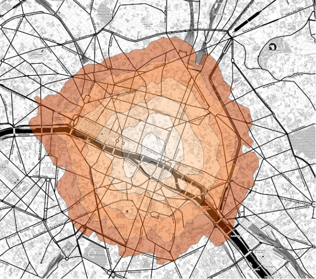
Why are isochrones sometimes used instead of “as the crow flies” (i.e. a circle)? In Retail, time is one of the most important factors when going to a store or shipping out a delivery. A location might be 2 miles from a customer, but due to dense traffic, it might take me 10 minutes to get there. Instead, it might be easier to hop on the highway and drive 5 miles but instead arrive in 5 minutes.
Isochrones are also more robust to the differences between urban, suburban and rural areas. If one uses an “as the crow flies” methodology and specifies a 5 mile radius, one might be including too many customers in an urban area or excluding customers in a less dense, rural area.
Once a retailer has calculated the isochrone, they can combine it with other data like demographics or competitor datasets to generate insights about that serviceable area. How many customers live in that isochrone? What is the average household income? How many of my competitors are in the area? Is that area a “food desert” (limited access to supermarkets, general affordable resources) or a “food oasis”? Is this area highly trafficked? Answers to these questions are incredibly valuable when making a decision about a potentially multi-million dollar investment.
However, demographics, competitor, and traffic analytics datasets can be large, diverse, and difficult to crunch – even more so if complex operations like geospatial analytics are involved. Additionally, these algorithms can be challenging to scale across large geographic areas like states or countries and even harder to interact with in real time.
By combining the accelerated compute power of RAPIDS cuDF, cuGraph, and cuSpatial with the interactivity of a Plotly Dash visualization application, we are able to transform this complicated problem into an application with a simple user interface.
Mocking up a GPU accelerated workflow
Let’s think about the algorithm. So how can one calculate a drive-time area? The general flow is as follows:
- Pick a point
- Build a network representing roads
- Identify the node in that network that is closest to that point
- Traverse that network using an SSSP (single source shortest path) algorithm and identify all the nodes within some distance
- Create a bounding polygon from the furthest nodes
- Append data like demographics and competitor information filtered by the point in polygon operations of the polygon area
However, the idealized workflow above needs to be translated into real world functionality. Like all data visualization projects, it will take a few iterations to dial in.
Sourcing data and testing the workflow
While there are large and highly current datasets available for this type of information, they are generally not publicly available or are very costly. For the sake of simplicity and accessibility of this demo, we will use open-source data. For added accessibility, we will also scope the application to run on a single GPU with around 24-32GB of memory.
We started out by prototyping the workflow using a prototype PoC notebook to compute isochrones: Despite the broad data science tooling required to tackle this problem (from graph to geospatial), the ability of the different RAPIDS’ libraries to work easily in conjunction with one another without moving out of GPU memory greatly speeds up development.
Our initial workflow used the Overpass API for OpenStreetMap to download the open-source street data in a graph format. However, a query for a 25 mi radius took approximately 4-5 minutes to complete. For the end goal of making an interactive visualization application, this was way too long
The next step was to then pre-download the entire United States OpenStreetMap data, optimize it, and save it as a parquet file for quick loading by cuDF. With the isochrones workflow producing good results, we then moved on to adding demographic data.
We conveniently had formatted 2010 census data from a previous Plotly Dash Census Visualization available. All together, the datasets were as follows:
- 2010 Census for Population (expanded to individuals) combined with the 2010 ACS for demographics (~2.9 GB)
- US-street data ~240M nodes (~4.4 GB)
- US-street data ~300M edges (~3.3 GB)
Combining and filtering datasets
We then prototype notebooks for data prep and census implementation in another notebook. With such a large, combined dataset, computational spikes often resulted in OOM (out of memory) errors or in certain conditions took longer than ~ 10 seconds to complete. We want to enable a user to click on ANY point in the continental US and quickly get a response back. Yet, after that initial click interaction, only a small fraction of the total data set is needed. To increase speed and reduce memory spikes we had to encode some boundary assumptions:
- For this use case, a retailer would not be interested in demographic information more than a 30 mi radius away from the point.
- While datasets exist for more realistic road speeds (speed limit and traffic based), for simplicity we would assume an average speed.
After adding in these conditions, we were confident that we could port the notebook into a full Plotly Dash visualization dashboard.
Building an interactive dashboard with Plotly Dash
Why build an interactive dashboard? If we can already do the compute in a notebook, why should it be necessary to go through the effort of building a visualization application and optimize the compute to make it more interactive? Not everyone is familiar with using notebooks, but most can use a dashboard (especially those designed for ease of use). Furthermore, an interface that reduces the mental overhead and friction associated with doing what we actually want, asking questions of our data, encourages more experimentation and exploration. This leads to better, higher quality answers.
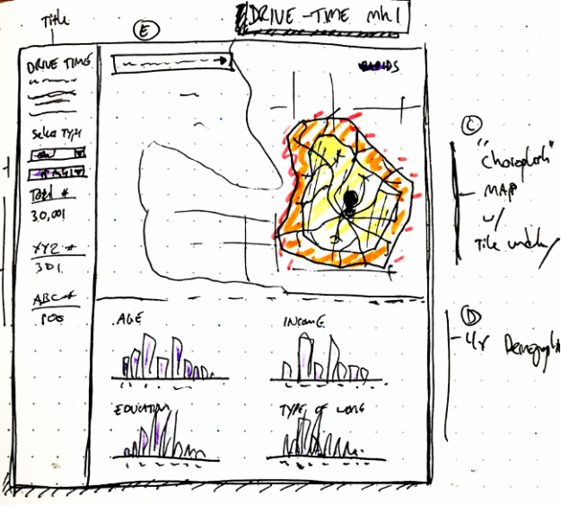
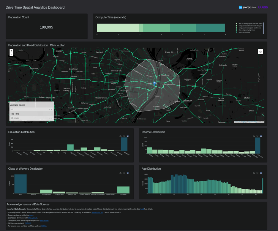
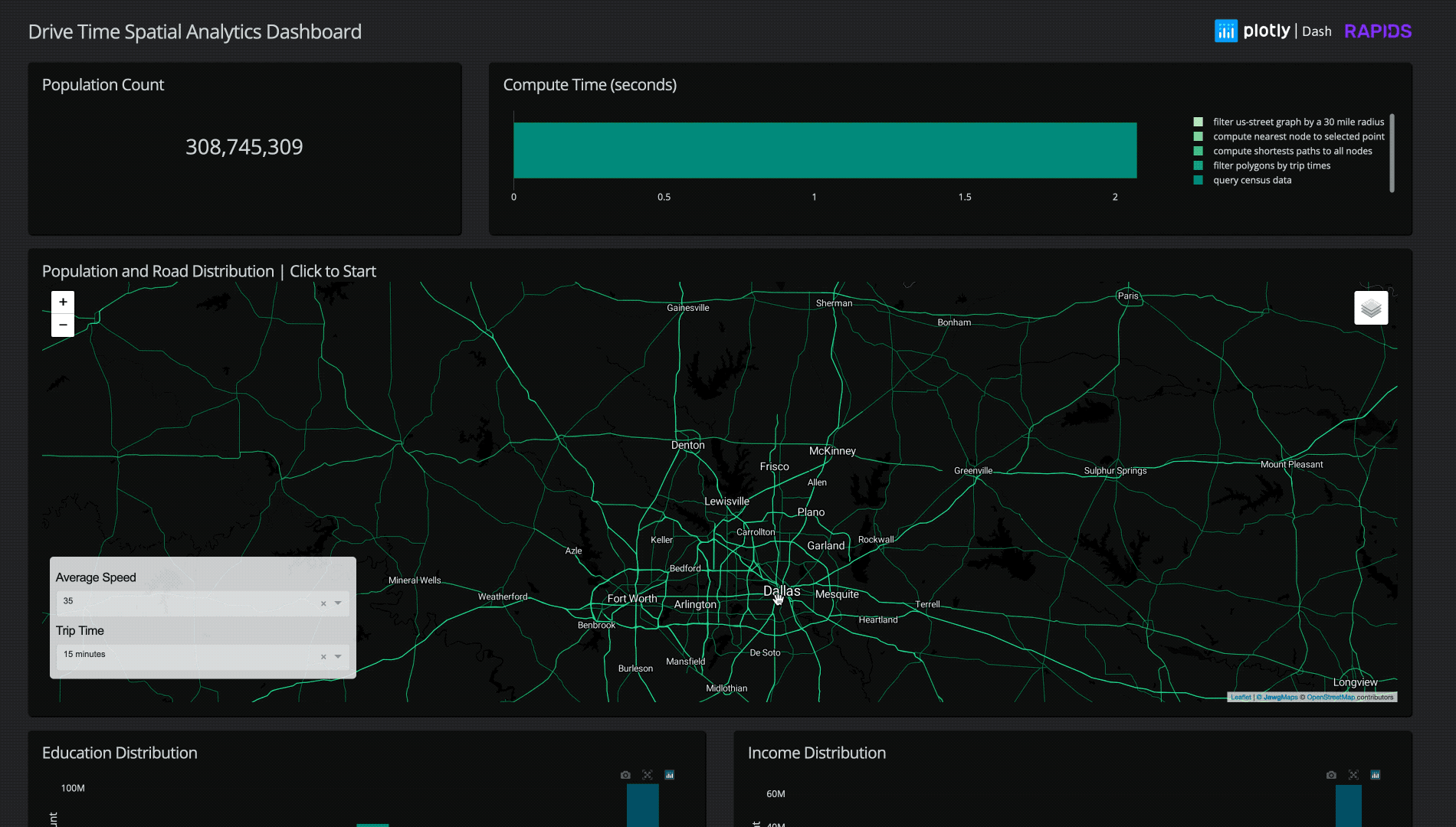
Starting out with a quick sketch mock-up (highly recommended for any visualization project) we went through several iterations of the dashboard to further optimize memory usage, reduce interaction times, and simplify the UI.
We found that by taking advantage of Dask for segmented data loading, we could drastically optimize loading times. Further optimization of cuSpatia’s PiP (point in polygon) and cuDF groupBy further reduced the compute times to around ~2-3 seconds per query in a sparsely populated area, and ~5-8 seconds in a densely populated area like New York City.
We also experimented with using quad-tree based point in polygon calculations for a 25-30% reduction in compute time, but because the current PiP only takes ~0.4 – 0.5 seconds in our optimized data format, the added memory overhead was not worth the speed up in this case.
For our final Dashboard implementation GitHub, running a chain of operations to filter a radius of road data from the entire continental US to a selected point, load that data, find the nearest point on the road graph, compute the shortest path for the selected drive-time distance, create a polygon, and filter 300 million+ individual’s demographic data typically takes just 3-8 seconds!
Conclusion
Being able to click on any point in the continental US and, within seconds, compute both the drive time radius and demographic information within is impressive. Although this is only using limited open-source data for a generalized business use case, adapting this demo into a fully functional application would only require more precise data and a few minor optimizations.
While the performance of using GPUs is noteworthy, equally important is the speedup from using RAPIDS libraries together. Their ability to seamlessly provide end-to-end acceleration from notebook prototype to stand-alone visualization application enables interactive data science at the speed of thought.
