TL; DR
The use of Plotly’s Dash, RAPIDS, and Data shader allows users to build viz dashboards that both render datasets of 300 million+ rows and remain highly interactive without the need for precomputed aggregations.
Using RAPIDS cuDF and Plotly Dash for real-time, interactive visual analytics on GPUs
Dash is an open-source framework from Plotly for building interactive web application-based dashboards using Python. In addition, the RAPIDS suite of open-source software (OSS) libraries gives the freedom to execute end-to-end data science and analytics pipelines entirely on GPUs. Combining these two projects enables real-time, interactive visual analytics of multi-gigabyte datasets, even on a single GPU.
This census visualization uses the Dash API for generating charts and their callback functions. In contrast, RAPIDS cuDF is being used to accelerate these callbacks for real-time aggregations and query operations.
Using a modified version of 2010 Census data combined with 2006-2010 American Community Survey data (sourced with permission from the fantastic IPUMS.org), we mapped every individual in the United States to a single point (randomly) located onto the equivalent of a city block. As a result, each person has unique demographic attributes associated with them that enable fine-grained filtering and data discovery not previously possible. The code, installation details, and data caveats are publicly available on our GitHub.
Part 1: data preparation for the visualization
While not the most current dataset, we chose to use the 2010 Census due to its high geospatial resolution, large size, and availability. With some modification, the final dataset of 308 million rows by seven columns (type int8) was large enough to illustrate GPU acceleration’s benefits dramatically.
Census 2010 SF1+ shape file data
We decided to focus on the census dataset; the obvious choice was to search the census.gov website, which includes numerous tabulation files for download. The most applicable one, summary file 1, had a population count section with attributes that include sex, age, race, and so on. However, this dataset is tabulated to a census-block level and not to an individual level (for various privacy reasons). The result was just 211,267 rows, one for each block, with sex, age, race counts.
We chose to use the census-block boundary shapefiles to expand the row count to equal the population counts for all blocks. Then, assign a random lat-long within the boundary, and create a unique row for each person. The script to do this for each state can be found in Plotly-dash-rapids-census-demo. Switching to the more user-friendly dataset files (both SF1 and tiger boundary files) provided by the data finder tool on the IPUMS NHGIS site speeds up the process.
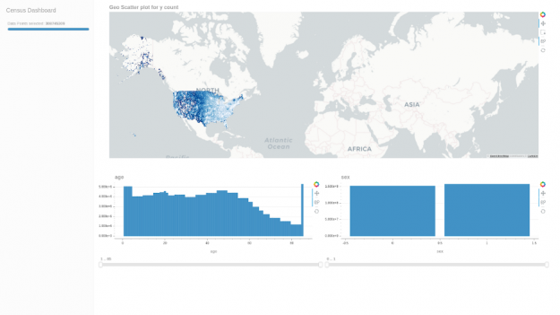
Throughout the data munging process, apart from double-checking the aggregations per block matched, we used our own cuxfilter for rapid prototyping and visual accuracy checks. In this case, it was as simple as the following snippet to have an interactive geo-scatter plot for the full 308 million rows:
ACS 2006–2010 data
Curious if we could combine additional interesting attributes to cross filter on, such as income, education, and a class of workers, we added the 5-Year 2006–2010 American Community Survey (ACS) dataset. This dataset is aggregated over census-block-groups (one level larger than census-blocks). Thus, we decided to take the aggregations over the block-groups and arbitrarily distribute them over each individual while still maintaining block-group level aggregate values. The modified dataset included:
- Sex by Age.
- Sex by Educational Attainment for the Population 25 Years and Over.
- Sex by Earnings in the Past 12 Months (in 2010 Inflation-Adjusted Dollars) for the Population 16 Years and Over with Earnings in the Past 12 Months.
- Sex by Class of Worker for the Civilian Employed Population 16 Years and Over.
The common column is Sex, which is used to merge all datasets. However, while this approach provides additional interesting attributes to filter on, there are a few caveats as a result:
- Cross filtering geographically or on a single column will produce accurate counts for all the other columns.
- Cross filtering multiple non geographic columns simultaneously will not necessarily produce realistic counts.
- The attributes associated with an individual are only statistical and do not reflect a real person. However, they are accurate when aggregated to the census-block-group level and greater.
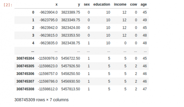
The notebooks that execute the process can be found on plotly-dash-rapids-census-demo. The final dataset looks something like this:
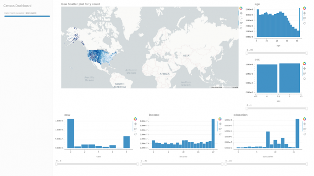
Here is a quick cuxfilter dashboard to verify the dataset values:
Resource Links:
- Final Modified Dataset (~2.9 GB tar parquet file)
- All Data Prep Code (GitHub)
Part 2: building the interactive dashboard using Plotly Dash
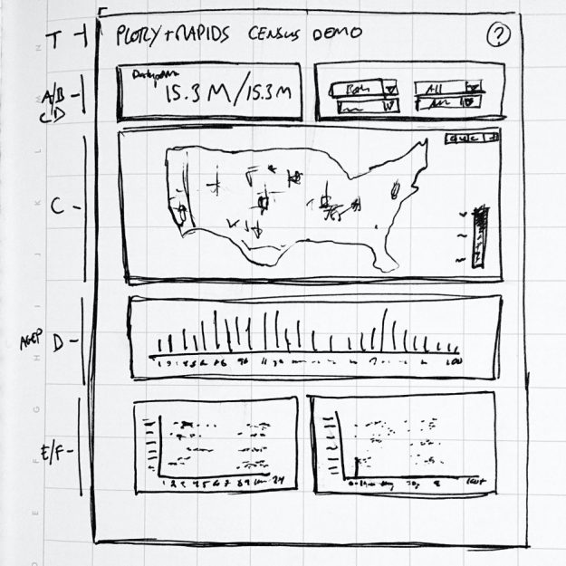
Dash supports adding individual Plotly chart objects in a dashboard, along with individual callbacks for each object figure, selection, and layout using just Python. For example, the charts in the dashboard based on the dataset above are:
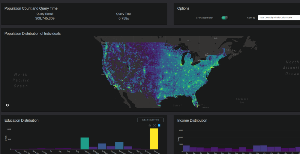
Scattermapbox: Population Distribution of Individuals
This chart consists of two layers:
- Scattermapbox layer.
- Datashader generated an output image on top of it.
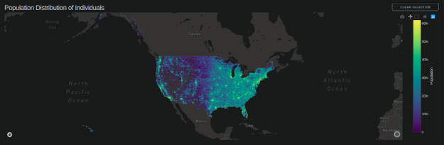
Chart update callbacks are triggered on:
- ‘Relayout-data’ (scroll-in, scroll-out, mouse pan) the datashader image is re-rendered as per the zoom level so that the resolution is constant.
- Dropdown selects ‘Color by’.
- Box selection on Education, Income, Class of Worker, and Age charts.
- Box selection on Map.
Bar charts: education, income, class of workers, age
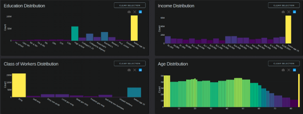
Chart update callbacks are triggered on:
- Box selection on Education, Income, Class of Worker, and Age charts.
- Box selection on Map.
- Dropdown select of ‘Color by’.
Where GPUs fit and how they can help:
Each chart in this dashboard benefits from GPU acceleration through cuDF: Using the GPU-accelerated mode, a filtering or zooming interaction generally takes around 0.2–2 seconds on a 24GB NVIDIA TITAN NVIDIA RTX. Running on a high-end CPU and 64GB of system memory, the same interaction generally takes 10–80 seconds. Typically, the cuDF GPU mode is over 20x faster than the Pandas CPU mode per chart. The 20x difference is what transforms a reporting dashboard into an interactive visual analytics application.
Data visualization is an iterative design process
Though such a well-documented and usable dataset as from the Census, learning about the data and making a viz to interact with it effectively always seems to take longer than any preliminary look at the dataset might suggest.
As with all data visualization, the end result often depends on finding the appropriate balance between the data and charts you have available, the story you are trying to communicate, and the medium (and hardware) you are communicating through. For instance, we spent several iterations on column formats to ensure that the GPU usage reliably stays under our 24GB single GPU limit while still allowing for smooth interaction between multiple charts.
Working with data is complex, and working with large datasets makes it more so, but by combining Plotly Dash with RAPIDS, we accelerate the capability of analysts and data scientists. These libraries permit users to work in a familiar environment and produce bigger, faster, and more interactive visualization applications ready for production out of the box – pushing the boundaries of traditional visual analytics into the realm of high-performance computing.
GTC digital live webinar
Hear Josh Patterson discuss more on the RAPIDS and Plotly collaboration during the upcoming GTC Digital live webinar State of RAPIDS: Bridging the GPU Data Science Ecosystem [S22181] on May 28th at 9AM PDT.
Community and next steps
Plotly and RAPIDS thrive from their open source communities, and we want to see them grow together. In the future, we are looking towards building tighter integration with Dash and also robust multi-GPU support with dask_cuDF.
Finally, we would like to see developers try out the tools and create awesome-looking demos on the many large-scale datasets out there, so let us know how RAPIDS made it possible to work with these datasets! Who knows, maybe we will have an even better 2020 Census visualization app ready in a year!
NVIDIA inception
Plotly is also a Premier member of NVIDIA Inception, a virtual accelerator designed to support startups using GPUs for AI and data science applications. The program is open for all to apply and gives access to NVIDIA engineering support and hardware access. If interested, apply here.
Helpful Links
- RAPIDS Plotly community webpage with demos
- RAPIDS Plotly Dash census demo GitHub repo
- A recent blog on Plotly Medium covering RAPIDS integration and partnership
This post was originally published on the RAPIDS AI blog.
