Work continues on improving the UX and capabilities of our GPU cross-filter dashboard library, cuxfilter. Here is a quick recap of its latest features.
First, it is as easy as ever to access cuxfilter. Just run a standard RAPIDS install as shown in the getting started page. Additionally, you can try it online at PaperSpace. One of the powerful benefits of a full RAPIDS installation means you can work on your data and visualize it within a single jupyter notebook or lab instance.

Here is a list of some of the major feature highlights:
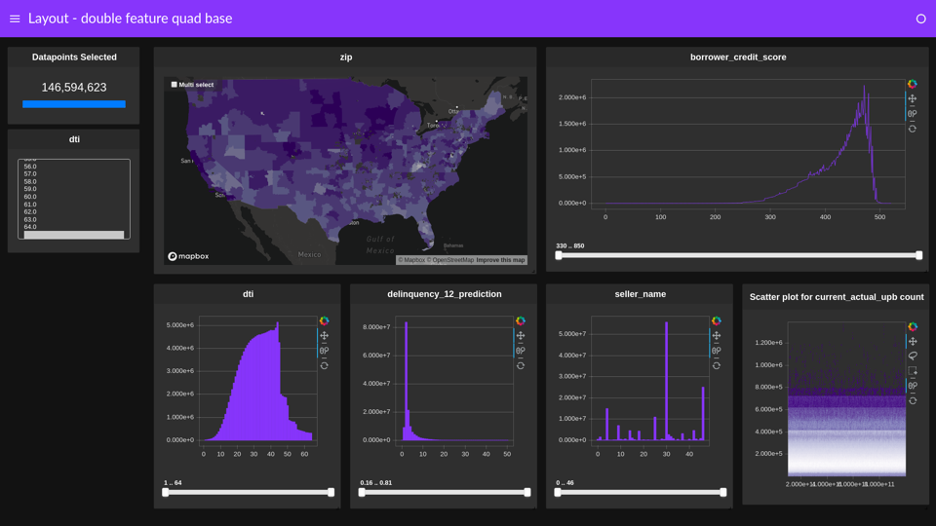
- High-density scatter, line, heatmap, and graph charts through Datashader. Also, choropleth maps from Deck.gl, and bar and line charts from bokeh.
- A fully responsive, customizable layout with a widget side panel.
- Themes, such as the dark one shown preceding.
- A preview feature using
await d.preview()that generates a .png image of the full dashboard inline with your notebook. - Ability to export the selected data in an active dashboard by using the
d.export()call. - Ability to deploy as a standalone application (outside of a notebook), as explained in our documentation for deploying multiuser dashboards.
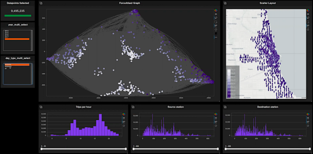
You can try all these and more features in our tutorial notebook, and follow along in our tutorial video. The screenshot shown in figure 2 is one of the dashboards created. A compelling example of how to combine RAPIDS libraries together to quickly create powerful cross-filterable dashboards in just a few lines of python.
Going forward, we continue to improve cuxfilter and use it to collaborate with the enormous python viz community, such as bokeh, holoviews, panel, and datashader projects. We encourage you to try it out, and as always, if you have any issues with feature requests, let us know on our GitHub. Happy cross-filtering!
Resources:
- cuXfilter docs: https://docs.rapids.ai/api/cuxfilter/stable/
- Tutorial video: https://youtu.be/kd58yZrl2BU
- Tutorial notebook: https://github.com/rapidsai-community/showcase/tree/main/team_contributions/cuxfilter-tutorial
This post was originally published on the RAPIDS AI blog.
